
[Pt 1/2] We analysed 8 Travel apps with Adapty
Offer a Lifetime plan. But price it right like PeakVisor.

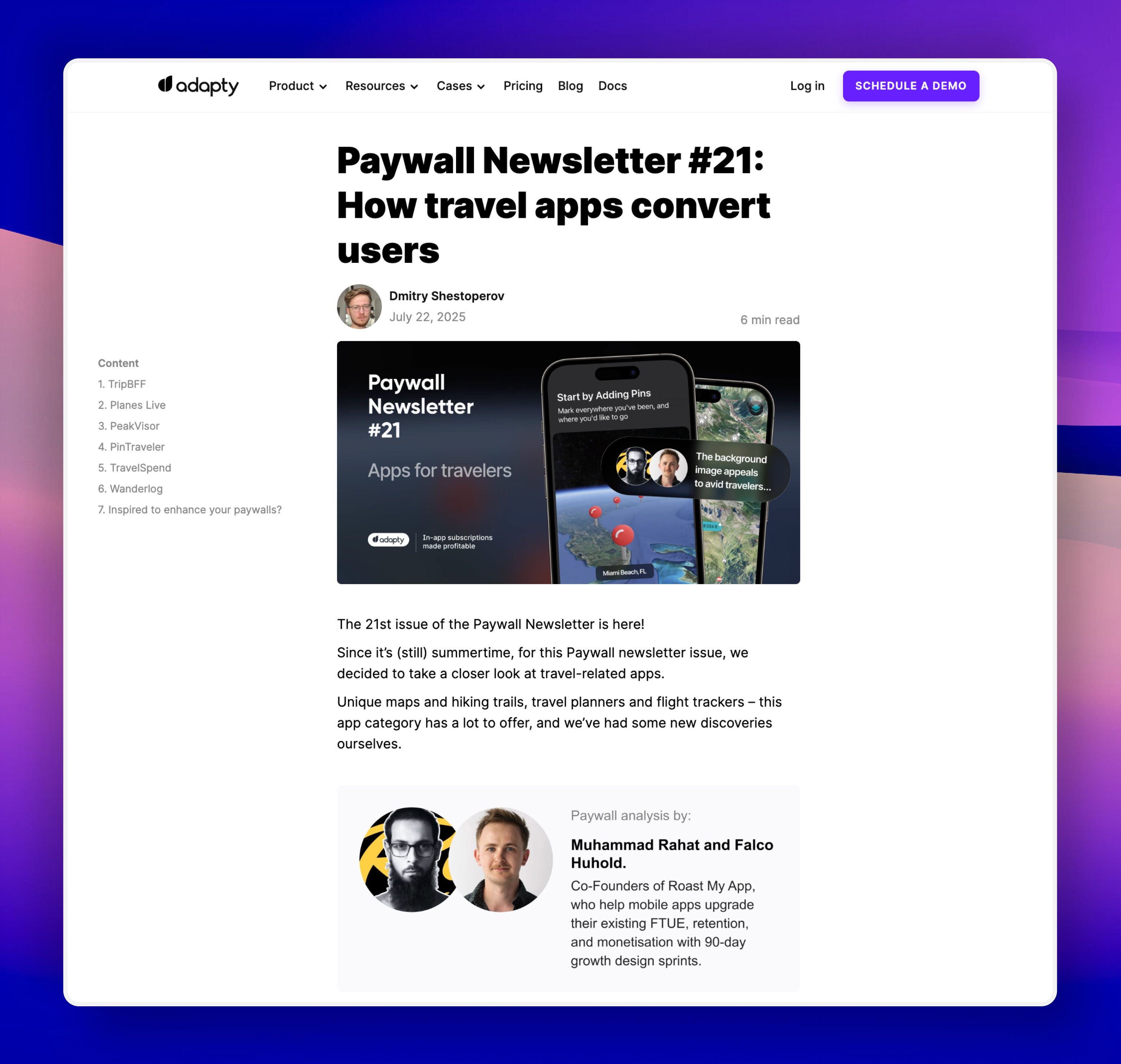
Last week, we joined forces with Adapty.io and deep dived into 8 consumer apps from the travel industry.
Our goal? To reveal how travel apps [both large and small] convert downloads into paid customers within the initial few minutes of their in-app journey.
A little side note before you begin: We believe the pre-paywall user experience is as important as the paywall itself [if not more].
In today’s edition, we introduced a ‘setting the scene’ section, where we inform you exactly what happened before the paywall was displayed.
Now with that out of the way, let’s get to the good stuff…
[All revenue and download estimates are taken from Appfigures]
1. OnX [$5M revenue, 55K downloads in May 2025]
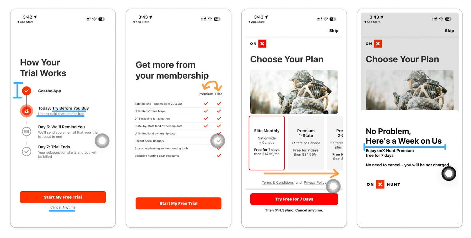
Setting the scene [pre-paywall ux]
Before users make it to the paywall, they’ve already committed to the app by creating their account, turning on location permission, and answering a series of hunting-related questions.
What’s working well?
Screen 1: ‘How your trial works’ timeline caters well to skeptical customers who aren’t 100% convinced to pay for a subscription yet. The first step, ‘get the app’ marked as done, is a subtle way to make users feel they’ve already accomplished something.
Phrases like ‘try before you buy’, ‘unlock paid features for free’, and ‘cancel anytime’ reassure users that “You will experience the best of OnX without paying anything [at least for now]”
Screen 2: It’s NOT a “What’s included in Free vs. Premium” comparison table [like we typically see]. It’s rather a “Premium vs. More Premium” comparison table.
It’s a brilliant pattern because you’re influencing the buying decision without allowing users to think “What’s the free plan like?”.
Areas for improvement:
Screen 3: High LTV subscription plans may go unnoticed because users have to scroll horizontally to realize they even exist in the first place. The overall plan overview appears somewhat cluttered. And it’s hard to compare and choose the right plan.
Here’s 1 needle-moving testing idea: Remove the horizontal scroll. Vertically place all the plans. Group ‘Elite’ and ‘Premium’ plans separately for easier comparison.
Additional comment:
Screen 4: OnX offers a ‘reverse trial’ if you skip the original paywall. People can use its premium version anyway, but for a limited amount of time. These next 7 days are crucial. Your users need to receive enough value out of the app to go, “I have seen enough. I'd better subscribe to keep my perks”.
2. PeakVisor [$50K revenue, 25K downloads in May 2025]
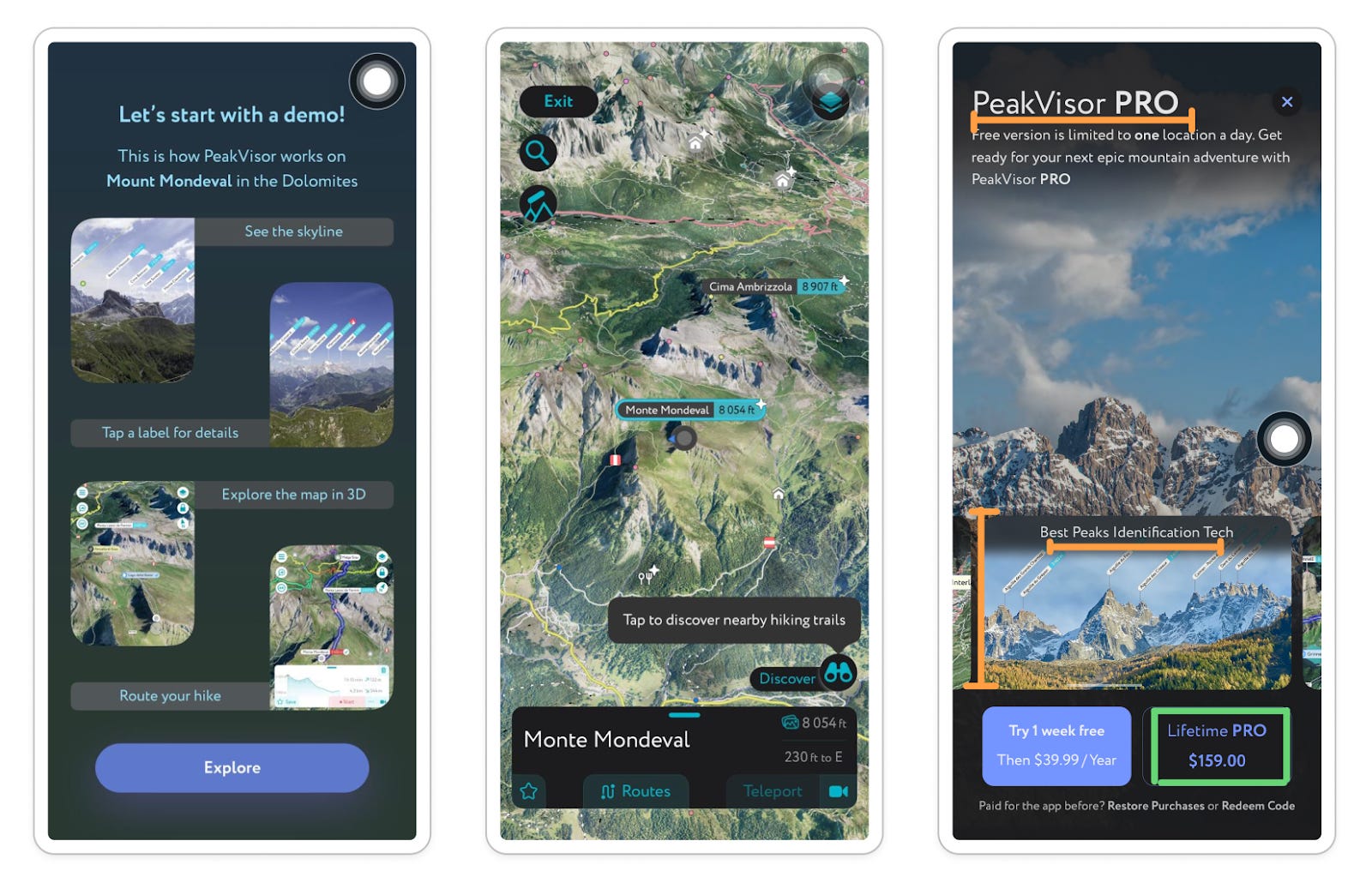
Setting the scene:
All users start with an intro demo of how Peakvisor works. The AHA moment is delivered quickly before getting hit with the paywall. Straightforward, to-the-point onboarding like this should lead to higher paywall views.
What’s working well:
The lifetime plan’s pricing is almost 4X the yearly plan. Most subscribers won’t stick around that long anyway with the yearly plan. People picking the lifetime option is already a big win for Peakvisor’s LTV.
Areas for improvement:
The PRO feature carousel blends in with the background mountain video. The tiny font size also makes it hard to stand out. Overall, plenty of white space went underutilized.
Here are 2 needle-moving test ideas:
Hero the PRO features UI by showing them within an iPhone 16 device mockup. This would allow users to visualize exactly what they’ll get easily. [Take it up a notch by showing a video of the app features in action]
Understand what people are using the app for in reality, a.k.a their goals during onboarding. Is it identifying peaks? Planning hikes? Leverage it on the paywall by personalizing the headline rather than only saying “PeakVisor PRO”.
3. Pin Traveler [$25K revenue, 30K downloads in May 2025]
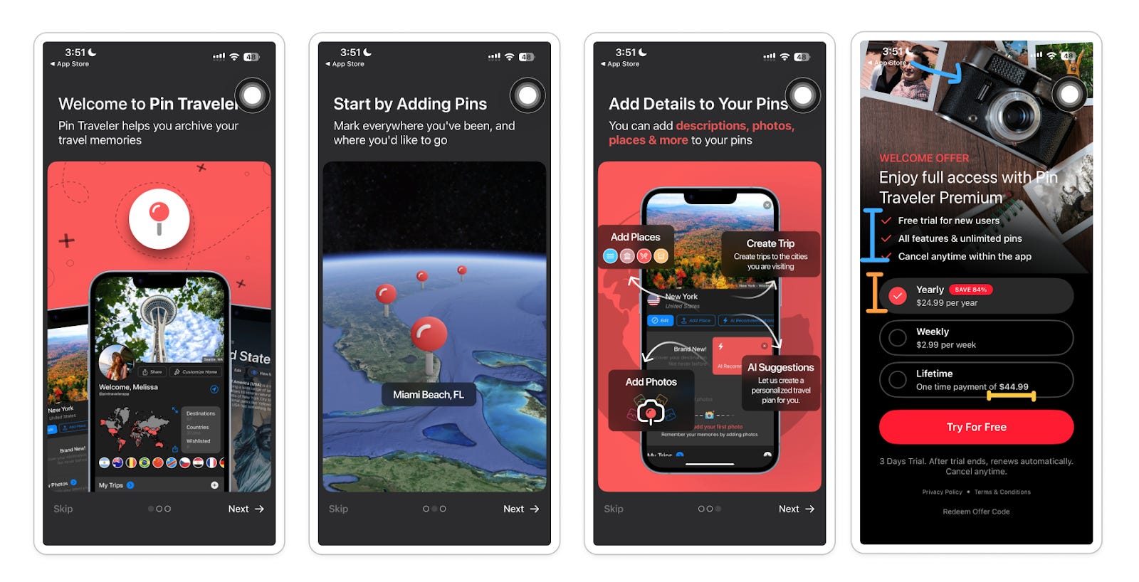
Setting the scene:
Users need to create an account first to get started. Next, they are welcomed with a 3-slide carousel that heroes the core features of the Pin Traveler app.
What’s working well:
We have seen the simple ‘checklist’ design pattern perform well, time and time again. Simple paywalls like these convert because people are familiar with the layout. There are no surprises.
The background image and its theme should appeal to an avid traveler, a.k.a the target demographics of the app.
Note, this is NOT the only paywall style/design used in the app. There are at least 2 other strategically designed paywalls that are triggered in multiple touchpoints of the user journey.
Areas for improvement:
Usually, a welcome offer is associated with a discount/strike-through price. That’s not the case here. This might lead to confusion: “Where’s the offer?”
Most may have no clue what “all features + unlimited pins” means if they have skipped reading the pre-paywall carousel content. The conventional route is to be specific about what feature gets unlocked.
We wouldn’t shy away from increasing the Lifetime plan’s pricing at least 3X more than the yearly plan. Anyone passionate about traveling will use the app for years on end. You’d be leaving money on the table if they pick the lifetime plan now and continue using the app for 2+ years.
Of course, we’d check in with yearly subscription retention numbers before we decide to do anything crazy.
4. Places [$50K revenue, 20K downloads in May 2025]
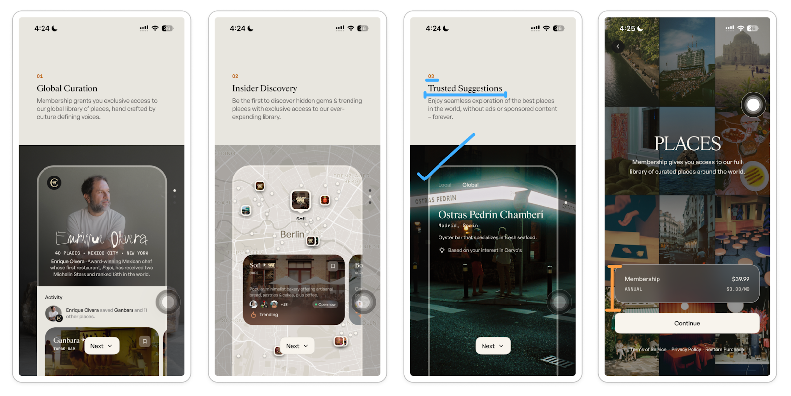
Setting the scene:
Users need their phone number [and also verify it] just to get started. No one can skip the basic info questions. People are asked to enable their location, contact, and push permissions before the paywall. So, a lot of friction straight off the bat.
What’s working well:
The 3 feature carousel screens right before the paywall explain ‘what you get’ incredibly well.
The slides are numbered. The title word count was kept to a bare minimum. And the app’s UI mockups are beautifully presented. You can tell everything’s consciously designed to foster brand recognition.
Nothing much is going on behind the paywall. Probably the right way to go for people who can be sold with aesthetics, authenticity, and ‘good vibes only’.
Areas for improvement:
Introduce a tiny ‘View other plans’ button below the annual plan. Pretty sure, there will be many who aren’t ready to commit to a yearly plan but would be happy to try out the membership for a monthly or a quarter plan [depending on their travel plans]
If you’ve made it this far, Congrats! We’ll stop at 4 today.
If you want to read the rest of our analysis:
Check out Adapty’s paywall newsletter #21 edition now.
Or wait till we publish the uncut version tomorrow.

Hi there!🫡 This is Muhammad Rahat and Falco Huhold from Roast My App
When you’re ready, there are 2 ways we can help you:
The 90-Day Product Growth Sprint™️: Challenge your existing first-time UX, retention, and monetisation numbers—without adding full-time growth PMs, analysts, and UI/UX designers on your payroll.
Unlike traditional consultants and agencies, we do not come in to advise/consult your team on what to do. We deliver you implementation-ready UI designs [as final deliverables] for your dev team to code, ship, and experiment with. More details on www.roastmyapp.co
Honest feedback after our 90-day Product Growth Sprint We are accepting 2 new consumer app clients. Want to steal the next spot?
The Roast My App Kitchen™️: Sometimes, all you need is just fresh eyes to reveal your blind spots and revenue leakages. If you’re stuck with a product problem and can't figure out what to fix first or which feature to roll out next…
Join our skool community for on-demand app roasts, access to our mobile PLG playbook, and more...

Hate being sold to? Hit ‘unsubscribe’. No hard feelings.
Love this format, super insightful as you give examples and what works / does not!
Now diving into Part 2☺️