
[Pt 2/2] We analysed 8 Travel apps with Adapty
Why "Try for $0.00" vs. "Try for Free" is NOT the same.

Hey Hey 👋 Welcome back to the 2nd part of our teardown of “8 consumer apps from the travel industry”.
We analysed OnX, PeakVisor, Places, and Pintraveler’s first-time UX and paywalls in my previous email. In case you missed it, you can find it here →
In today’s edition, we reveal the strategically designed UI patterns [and psychological triggers] used by travel apps, bringing home between $15K to $450K in MRR.
Side note before you begin:
We believe the pre-paywall user experience is as important as the paywall itself [if not more]. To inform you exactly what happened before a paywall was displayed, we included a ‘setting the scene’ for more context.
Now with that out of the way, let’s get to the good stuff…
[All revenue and download estimates are taken from Appfigures]
5. TravelSpend [$15K revenue, 10K downloads in May 2025]
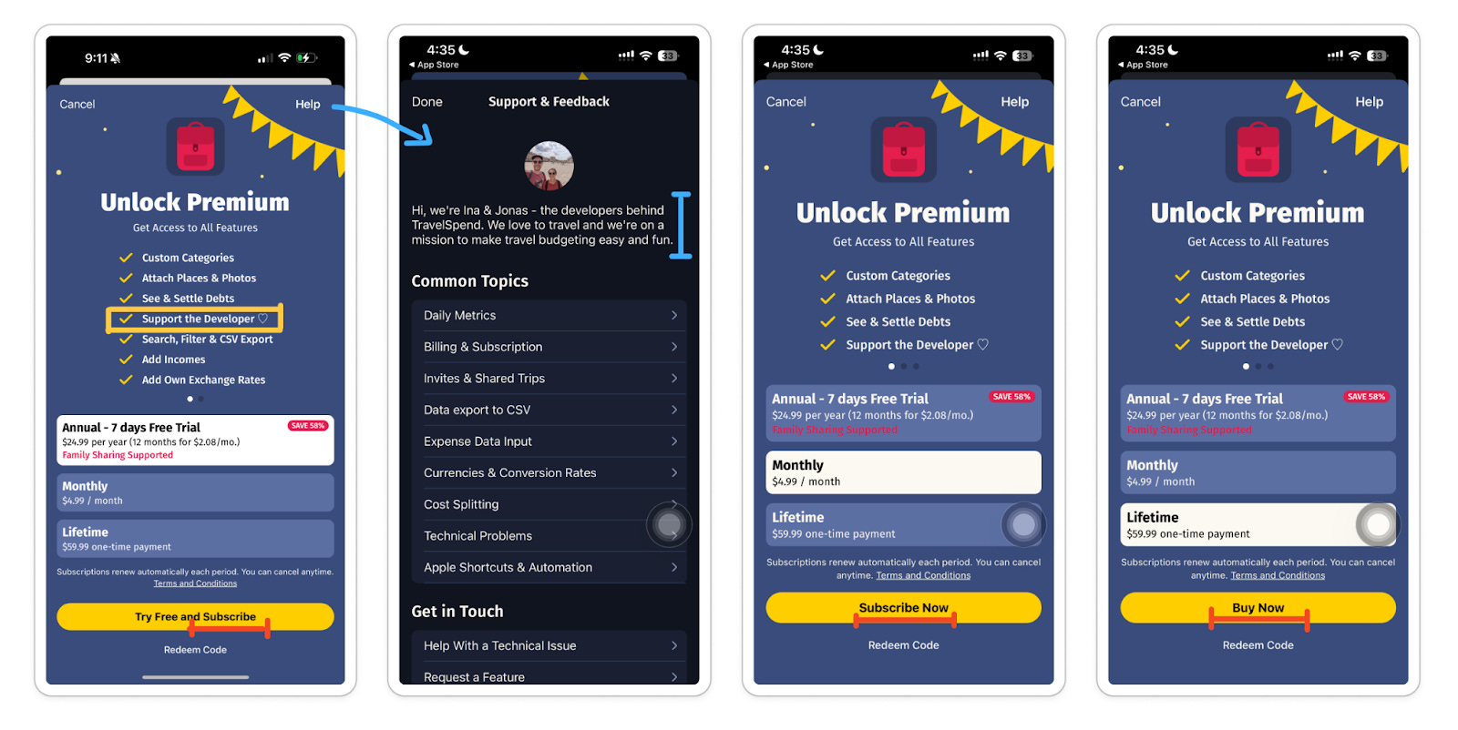
Setting the scene:
The paywall is displayed after account creation, app setup questions, and push notification opt-in screens.
Users are led to a small win quickly, as they commit by setting up their budget and 1st expense log.
What’s working well:
It’s natural to see huge drop-offs in the account creation screen. Travelspend gets around this by allowing people to ‘Continue as a guest’, and explore before signing up.
“Support the dev” on the ‘what you get’ checklist is interesting. A tap on the little ‘Help’ button on the paywall lets users discover the founder’s story behind building Travelspend.
A relatable mission like this builds an emotional connection between the users and the product, which in turn can influence purchase decisions. As a consumer, you’d be more open to helping passionate builders out over a traditional corporate-backed startup on any day.
Areas for improvement
Words like ‘subscribe now’ and ‘buy now’ in the CTA button copy may trigger negative reactions, like fear of commitment or being pushed into a decision. We can approach this in a positive and inviting tone like “Try 7 days for free”, “Unlock lifetime budgeting’ or just a simple ‘Continue’ [which always does the trick]
Most people can typically hold around 7 items in their short-term memory. Instead of listing out all features, only include the valuable items that make purchasing a no-brainer. It also might be a good idea to try marketing people’s go-to advice: “Lead with benefits, not features”. But we’d be careful not to sound too vague by doing so.
Falco’s a digital nomad, and a power user of Travelspend. He mentioned the best feature of the app [Apple Wallet automation]. But surprisingly, it wasn’t listed on the paywall. So forget everything we just said. Work your way by acting on this valuable feedback first.
6. TripBFF [$45K revenue, 25K downloads in May 2025]
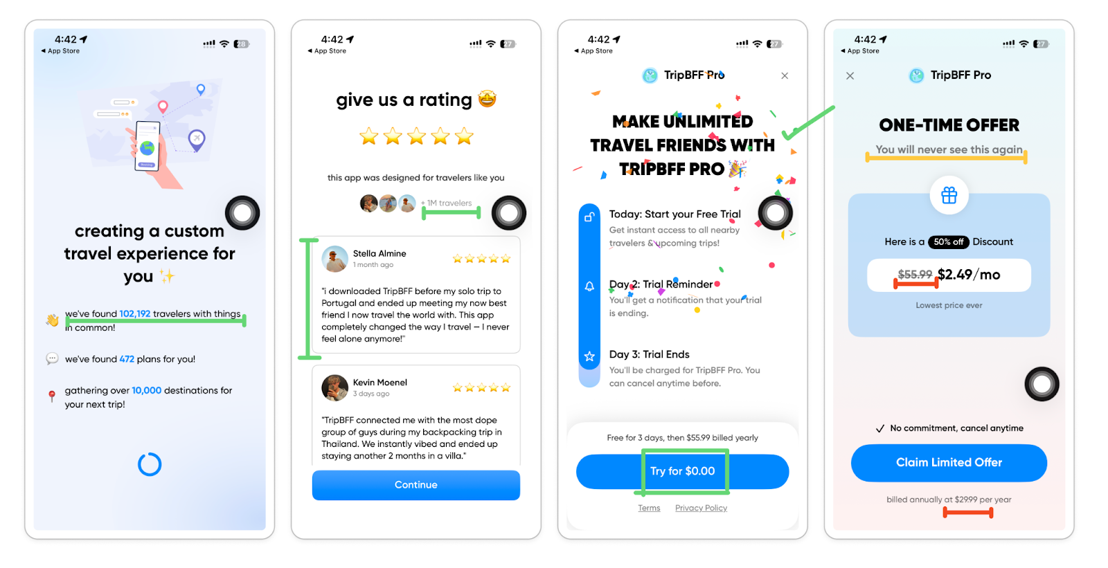
Setting the scene:
TripBFF promises users a custom travel experience based on their profile, interests, and the language they speak. Users are encouraged to enable location and push permission before the paywall. It makes sense since users can’t experience the AHA moment without giving out their location.
What’s working well:
FTUE is designed to get people on board by leveraging the bandwagon effect. They throw around specific numbers like “we found 102,192 travelers”, and “+1M travelers” along with traditional app reviews.
Social proof just before the paywall is always a great trust-building tactic.
But also watch out for ‘banner blindness’. People are getting desensitized to patterns like these, and many will question the authenticity of the reviews if they spot anything off, like stock images instead of a real avatar.Users also get a small dopamine hit from the confetti animation as they make it to the paywall.
“Try for $0.00” instead of “Try for Free” as a CTA copy is a smart move. The “$0.00” frame shifts consumers’ attention to the cost-saving benefit of free offers, which most likely have a stronger effect on price-conscious users.
This also allows people to perceive the product as having a higher intrinsic value compared to the "Free" frame, even though the cost is the same.
We know. Human psychology is pretty weird.
Areas for improvement
The paywall title “Make unlimited travel friends” is the only promise/selling point here. At this point, most users [if not all] do not 100% realize which specific perks they get to unlock. It wasn’t specifically mentioned anywhere before this trial timeline paywall.
In the one-time offer screen, using $55.99 (the annual price) as a strike-through and comparing it with a monthly price feels a bit deceiving. The math is also off. The offer says ‘50% discount’, but half of the original price, “$55.99”, is not $29.99/y. Isn’t it $27.99? Correct us if we’re wrong.
“You will never see this again” already creates a scarcity effect. But we can take it up a notch by introducing a timer to add a sense of urgency here, too.
7. Planes Live [$450K revenue, 110K downloads in May 2025]
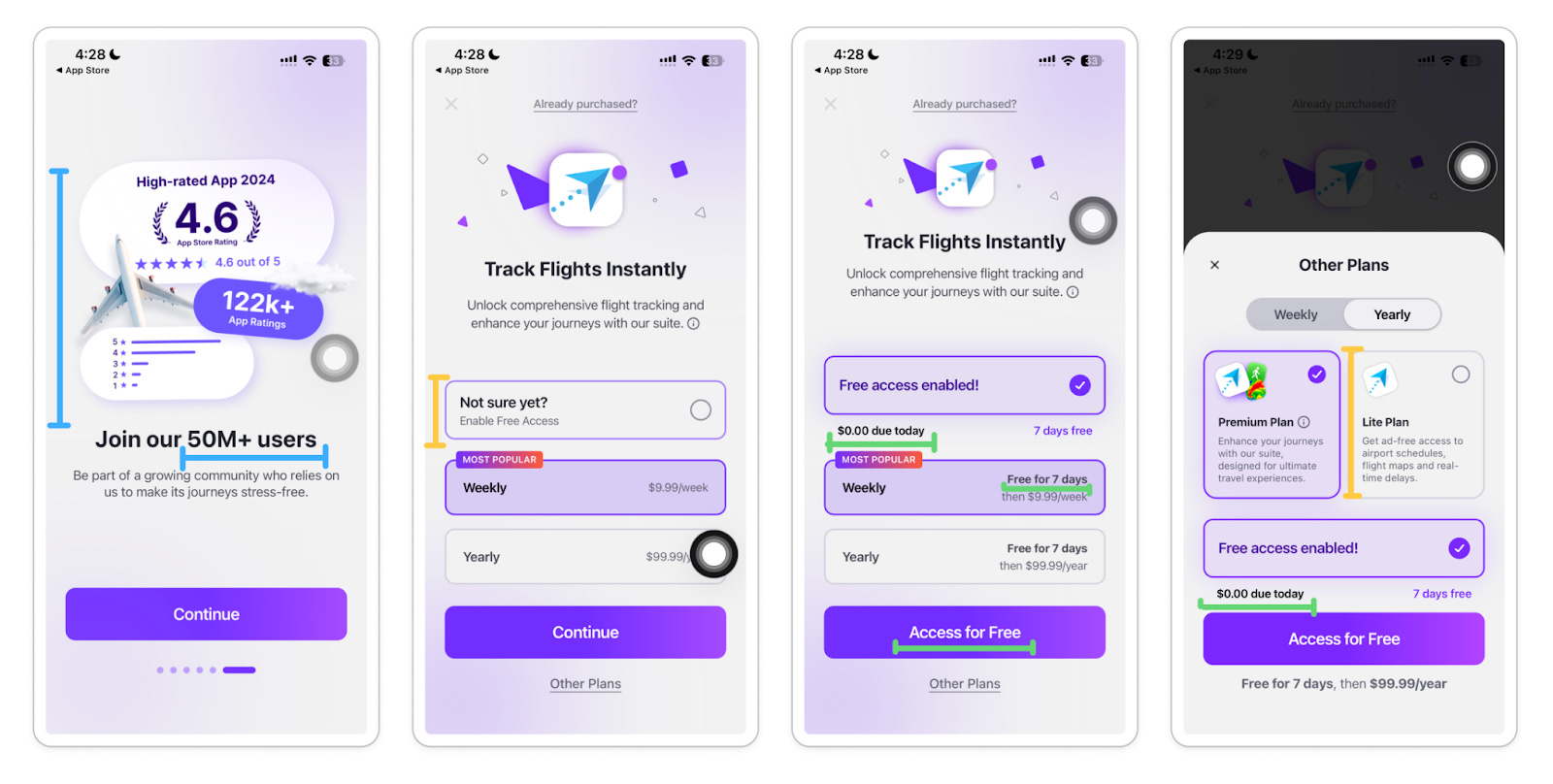
Setting the scene
Simple onboarding to paywall journey, which requires no user input.
The pre-paywall feature carousel is marvelously done. The visual assets look extraordinary. And the main benefits are communicated in simple language.
The most noteworthy mention is the ‘quantified social proof’ screen, which shows numbers like 50M+ users, 122K+ ratings, and 4.6 stars—right before the paywall. This is a great trust-building tactic you can implement on your app, too.
What’s working well:
“Not sure yet?” checkbox makes users subconsciously feel they’re in the driving seat, [and in more control] of their ‘buying decision’.
When the “Free Trial” is enabled, the paywall content updates with phrases like “$0.00 due today”, “Free for 7 days”, and “Access for free”. These are all great objection-handling copies for a ‘need-more-convincing’ type user base.
When you tap ‘View other plans’, the app also offers a ‘Lite subscription product’ at a lower price. Nicely done to keep things interesting for the ‘price-sensitive’ user base.
Potential testing idea:
When “Free access enabled” is checked by the user, instead of offering a trial to both the weekly and yearly plans, offer it to only 1 of them. E.g., free trial on a weekly plan, but no free trial on a yearly plan.
8. Wanderlog [$390K revenue, 150K downloads in May 2025]
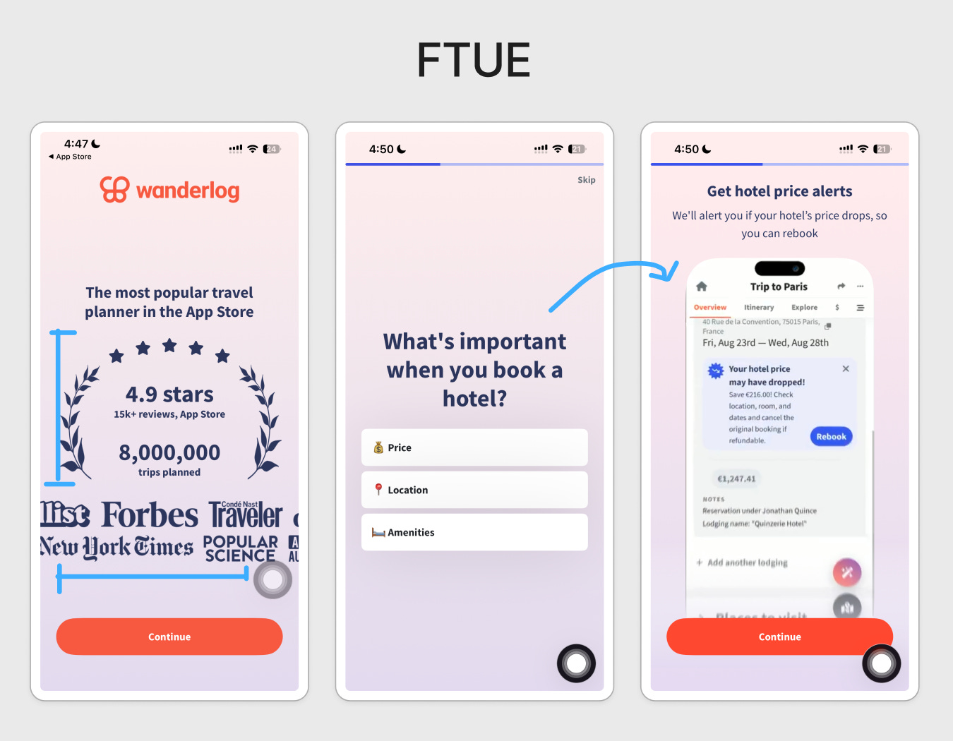
Setting the scene:
Wanderlog’s onboarding funnel is the longest one out of all the apps mentioned above.
It gains people’s trust right off the bat before signing up with quantified social proofs [eg. ratings and brand mentions from renowned media outlets like Forbes and the New York Times.
Each onboarding questions intentionally call out users’ problems, goals, and objections. Wanderlog will take this opportunity to present its in-app UI demos as a solution.
This problem-solution feedback loop makes it incredibly easy for users to come to this conclusion: “It feels like Wanderlog understands exactly what I’m here for. And I understand everything I can do with Wanderlog.”
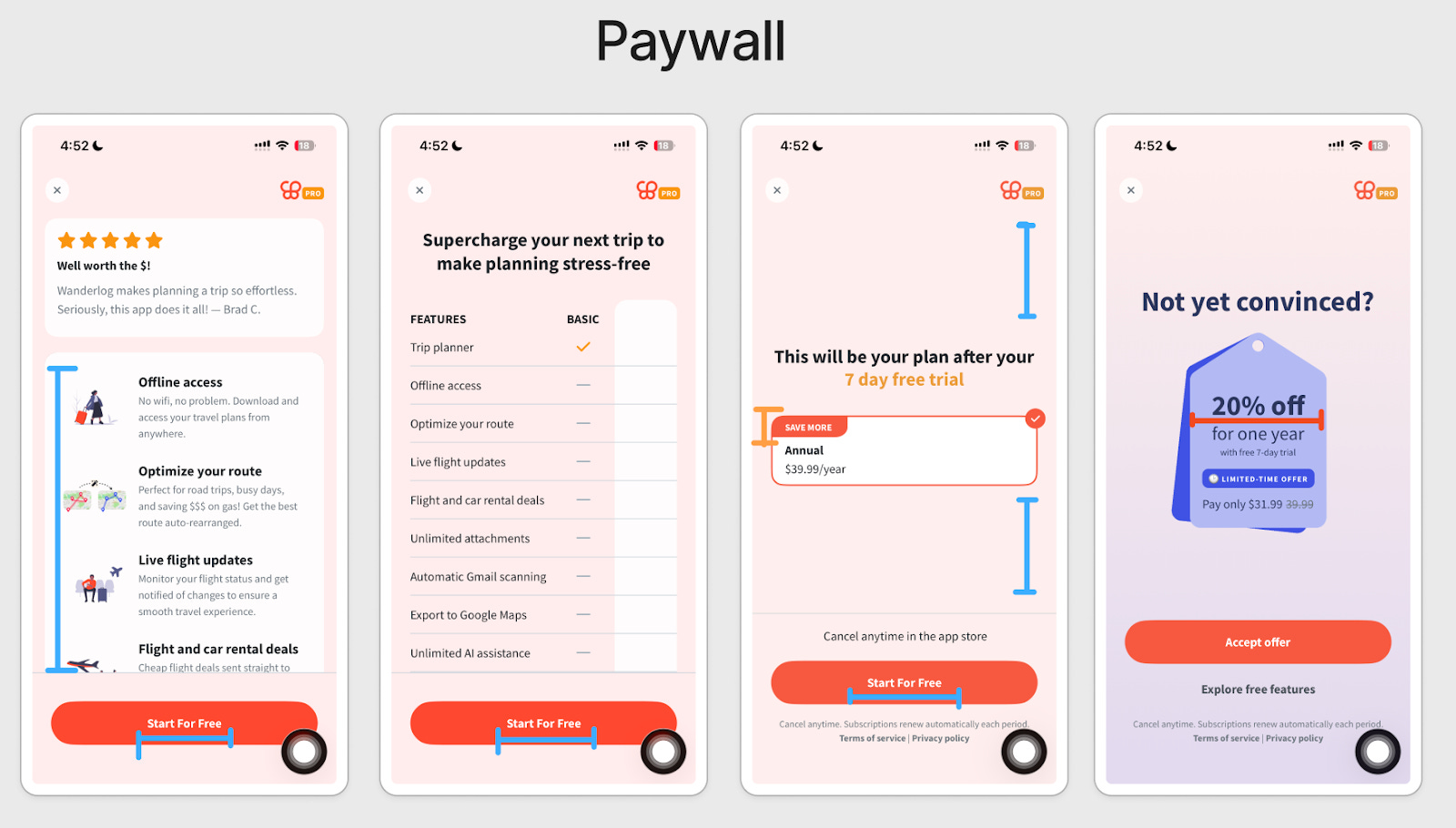
What’s working well:
Multi-page paywall allows Wanderlog to break down “pro features+benefits” information into short, easily digestible segments.
A comparison table is helpful as it summarizes everything, but it can also quickly be overwhelming.
“Start for Free” CTA button is kept consistent across all pages.
The final screen is minimally designed with plenty of whitespace. There’s no unnecessary noise to distract users from a purchasing decision. This pattern works only if you have properly educated your users on what you’re selling. [As you can imagine, Wanderlog gets a 10/10 regarding this.]
Areas for improvement:
“Save more” badge in the annual plan is not clear and rather confusing. We don’t see any other anchoring plans to compare with the annual plan.
Wanderlog will make a 2nd attempt with a 20% discount. The small discount may not be persuasive enough for the price-sensitive gang. So you might have to sweeten up the deal more to catch people’s attention and get more conversions here.
And that brings us to the end of all 8 app teardowns. 🎉
You deserve a pat on the back if you’ve made it through all.
That said, we’re carefully planning our content strategy for Substack. This means we will be showing up in your inbox with 2 main formats:
‘Reverse-engineering’/’Teardown’ of consumer apps exactly like today. We’ll be doing this as a bi-weekly thing.
Btw, do you want your app to be featured in our newsletter? Reply to this email with your link.‘Build in public’ style content where we share everything we learn along the way as we transition slowly into a consumer app publishing studio.
Last update: We’re days away from submitting our 1st app for review. ICYMI, we’re building a daily habit app for men. Here’s a sneak peek ↴


Hi there!🫡 This is Muhammad Rahat and Falco Huhold from Roast My App
If you run a consumer app business, there are 2 ways we can help:
The 90-Day Product Growth Sprint™️: Upgrade your existing first-time UX, retention, and monetisation numbers with our carefully designed 90-day Product Growth Sprint.
Unlike traditional consultants and agencies, we will not come in to just advise your team on what to do. We deliver you implementation-ready UI designs [as final deliverables] for your dev team to code, ship, and experiment with.
Imagine adding senior Growth PMs, Data Analysts, and UI/UX designers to your team—without having to pay their full-time salaries [i.e, saving $270K+/y of your runway]
More details on www.roastmyapp.co
Last time we checked, the trial-start rate is up by 12.5% in our current FTUE experiment for InTolerApp. Not statistically significant yet. But we’re off to a great start! We are accepting 2 new consumer app clients. Want to steal the next spot?
The Roast My App Kitchen™️: Sometimes, all you need is just fresh eyes to reveal your blind spots and revenue leakages. If you’re stuck with a product problem and can't figure out what to fix first or which feature to roll out next…
Join our Skool community for on-demand app roasts, access to our mobile PLG playbook, and more...
Not a fan? Hit ‘unsubscribe’. No hard feelings.
So many insights! Keeping it for inspiration ☺️